Design mantras # 4

Match

Design guidelines

The Check-list for creating great UI and UX design to make your design beautiful and easy to use

Typography

Design priciples

Typography is not about chosing fonts, it is to give user's optimal reading experience.

  • Readable fonts (max of 2 fonts).
  • Only use Siref fonts for reading materials.
  • Easy to read (max of 72 chars per line).
  • Clean and organized.
  • Align texts using baselines.
  • Creates emotional impact.

Sample Text

ABCDEFGHIJKLMNOPQRSTUVWXYZ

abcdefghijklmnopqrstuvwxyz

123456789!@#$%^&*()

Bold Italic

Regular

  • Left
  • Center
  • Justify
  • Right
  • Open Sans
  • Arial
  • Montserrat
  • Roboto
  • Lato
  • Raleway
  • Times New Roman
  • Amiri
  • Gorgia
  • Lora
  • PT Serif
  • Playfair Display

Colour

Design priciples

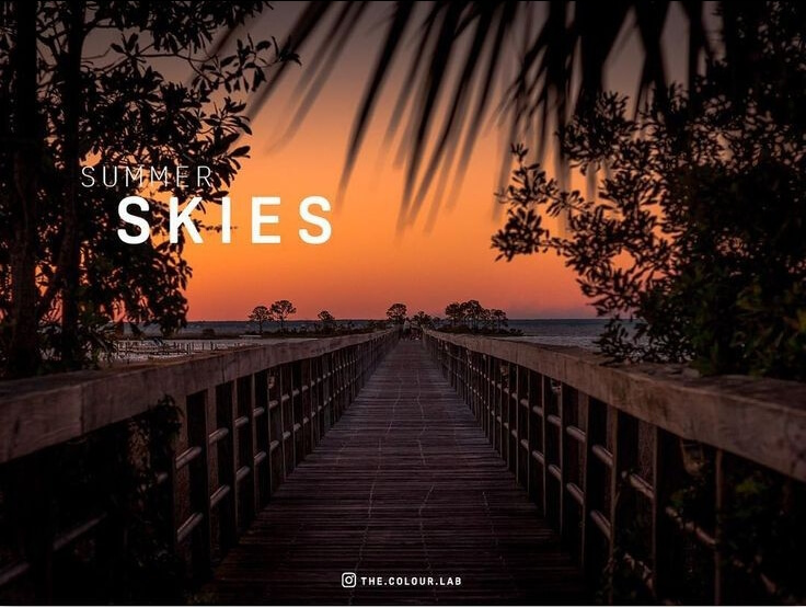
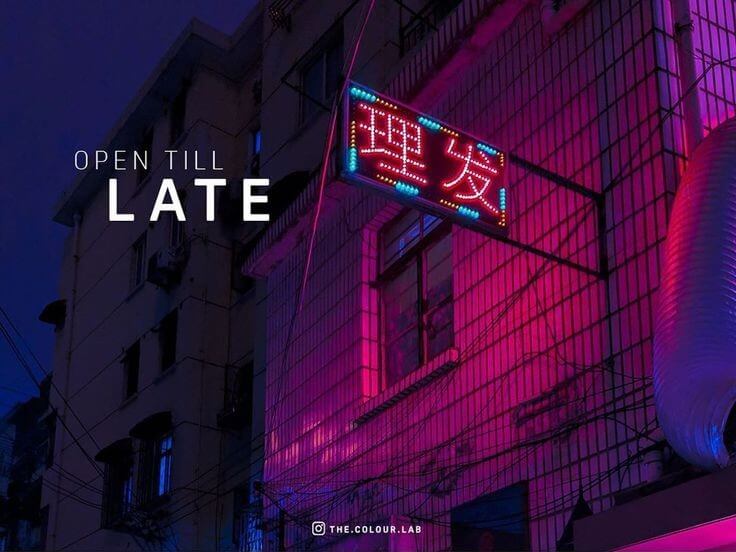
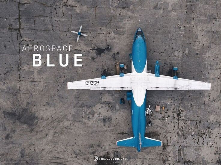
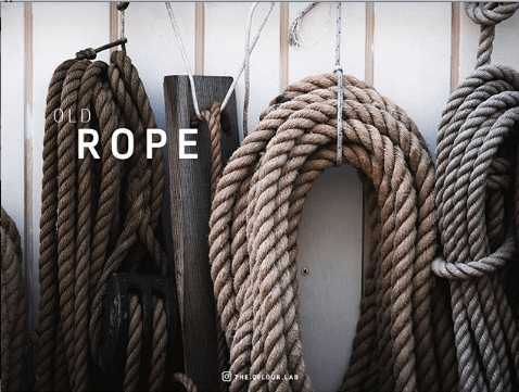
Color should be functional, not decorative. Use it to get the attention, stir emotion and suggest associate meaning.

  • Follow standard usage of colors
  • Must provide meaning (color meanings)
  • Must have emotional impact
  • Consider the Color-blinds
  • Only use bright colors to make visual accent
  • Minimize Optical fatigue.

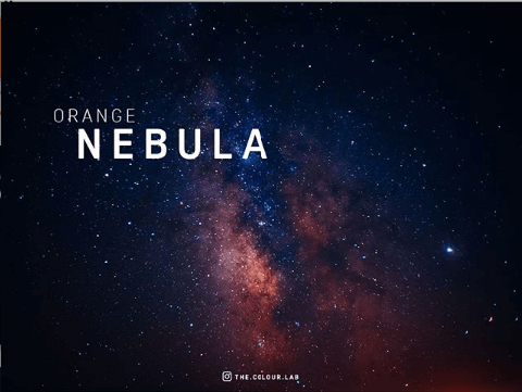
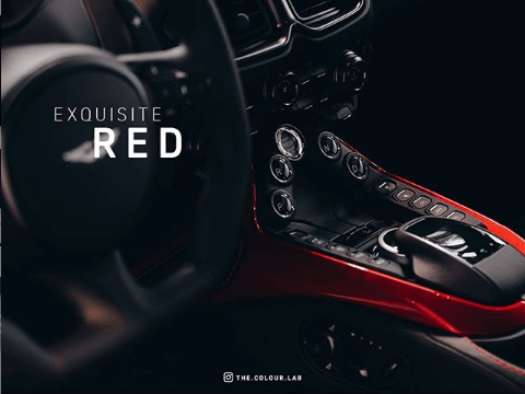
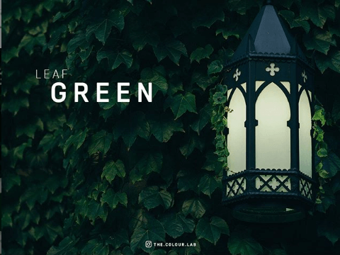
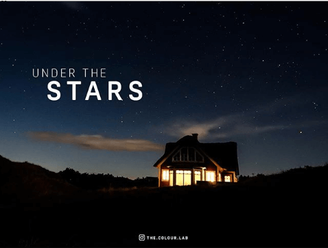
#FD9047

#AC5142

#4D3532
  • color-pallete
  • color-pallete
  • color-pallete
  • color-pallete
  • color-pallete
  • color-pallete
  • color-pallete
  • color-pallete
  • color-pallete
  • color-pallete
  • color-pallete
  • color-pallete
  • color-pallete
  • color-pallete
  • color-pallete
  • color-pallete
  • color-pallete
  • color-pallete
  • color-pallete
  • color-pallete
  • color-pallete
  • color-pallete
  • color-pallete
  • color-pallete
  • color-pallete
  • color-pallete
  • color-pallete
  • color-pallete
  • color-pallete
  • color-pallete
  • color-pallete
  • color-pallete
  • color-pallete
  • color-pallete
  • color-pallete
  • color-pallete
  • color-pallete
  • color-pallete
  • color-pallete
  • color-pallete

Media

Design priciples

Images can save you lots of words, but it should be meaningful and easy to understand or else it's just visual noise.

  • Should be in high quality resolution
  • Serves a purpose, message, and emotion.
  • Easy to understand.
  • Use icons appropiately (min of 25pixels).
  • Always use popular Icons (add label for uncommon icons).

Imagery

  • Realistic photographs (avoid creapy and fake smiling people).
  • The photographs have tell a story.
  • Focus on people not on things.
  • Use illustration when specificity isn't posible.

Best Resources (free stuffs)

Layout

Design priciples

Layout is crucial, it helps the users to navigate and digest your contents and encourages them to stay on the website longer.

  • Let the most important came forward.
  • Make balance & Group what's interrelated.
  • Must have Negative spaces, Rhythm and Harmony.
  • Lead the eyes of your Audience
  • Align everything with everything else.

UI and UX

Design is different from decoration.
What is the purpose of its existence?,
How it should be percieved by Audience?,
Why does it matter to anyone?
Think of design as problem solving.

  • Purposeful not just look good
  • Simple, easy to use and easy to understand
  • Must provide appropriate emotion

check out Joe Natoli on udemy for more UI and UX rules

Special Thanks

to Joe Natoli and all of his design courses on udemy,

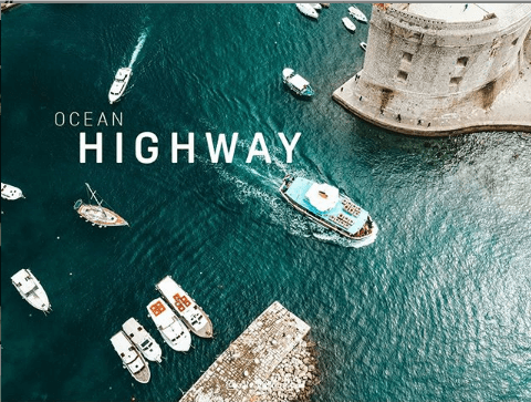
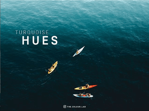
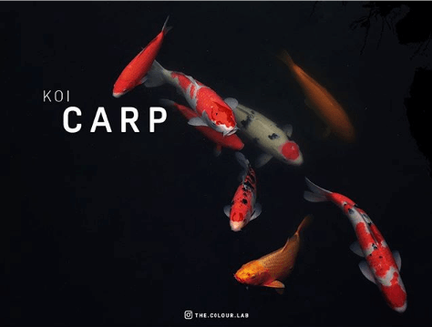
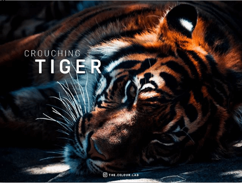
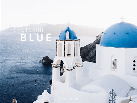
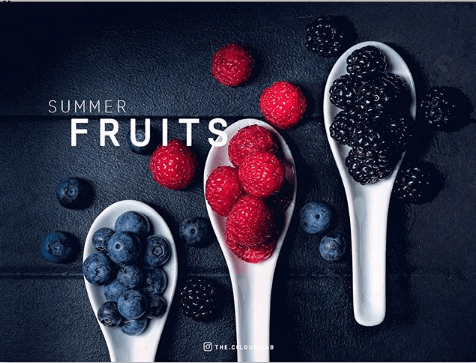
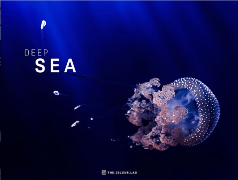
the.color.lab on instagram for creating great color palletes,

to all of the phographers and contributors on Stocksnap, Pexels, Unsplash, Burst, Pixabay, Picjumbo,

and ion-icons for creating good content.

Thank you,